Divi’s intuitive visual builder that makes it extremely easy to add images to a website. However, these images need to be optimized to the right dimensions so that they can work well with the design which is the tricky part.
YES, I get that it can be overwhelming to work with images especially when optimizing for multiple screens…
However, fret not!
In this article, I will teach you how to use and optimize images for your Divi website. I’ll leave out all the fluff and get right to the point with image dimensions and tips on getting better with images, in short, this is going to be an ultimate guide to Divi image sizes.
How to Optimize Divi Images Accurately
While Divi makes it extremely easy to build websites without code. It has a whole multitude of options to add images and that can definitely get in the way by making things more complicated.
Follow these key principles for optimizing image size:
- Column Layout: Maximum width of your image
- Aspect ratio: Height and width of your image
- Responsiveness: How your images are optimized for different screen sizes
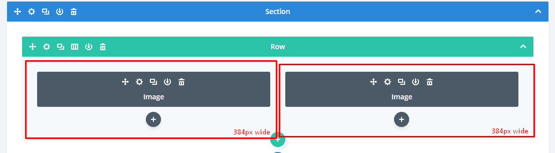
Using Divi’s Column Layouts
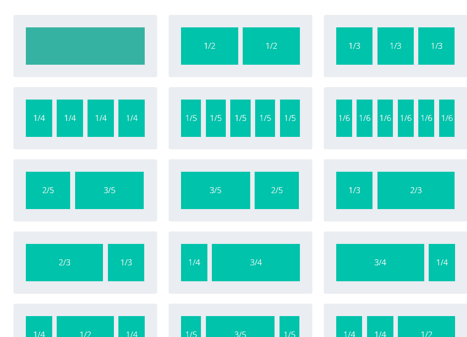
Divi Uses a whole multitude of column layouts that support images of different sizes however the hard part is actually getting those images to scale up and down as per different screen sizes.
Pro Tip: As a rule of thumb make sure your images at least as wide as the column it is going to be used into.
Image sizes for standard Divi Column Layouts:
1 Column Layout
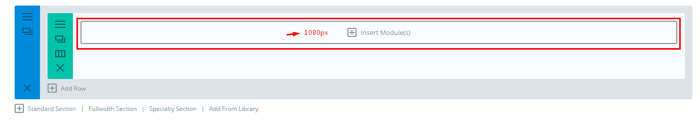
Recommended Image Width: 1080px
1/2 Column 510px
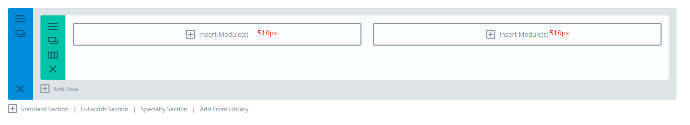
Recommended Image Width: 510px
1/3 Column 320px
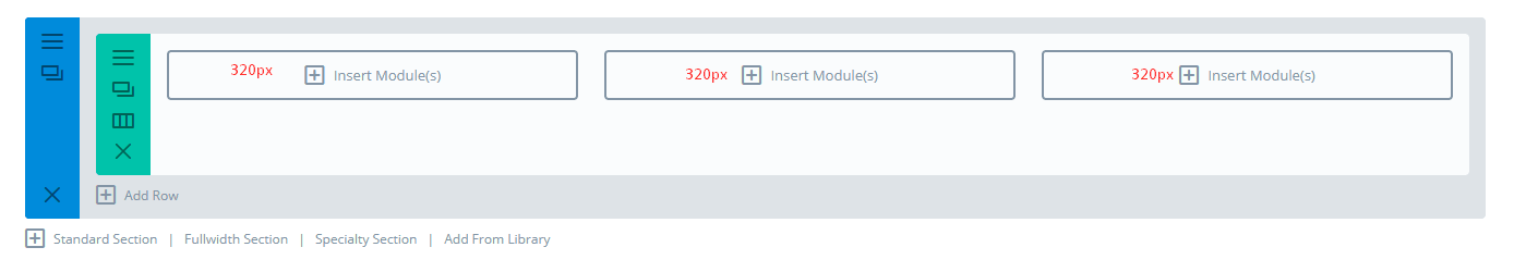
Recommended Image Width: 320px
1/4 Column 225px
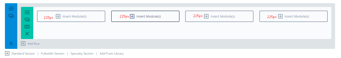
Recommended Image Width: 225px
However, the problem with using Divi column layouts is that they can’t accurately measure the height of your images which is affected by the content within that section and the screen size.
Using Aspect Ratio as a Reference
Aspect ratio is the ratio of width to height of an image or a screen and this is a much better measure to determine the size of your image for your Divi website. What’s more aspect ratio is important when optimizing images for small screens, especially 11 inch laptops.
If you use aspect ratio 16:9 to you can use the following dimensions for your images:
- 1 column: 1080px by 608px
- 3/4 column: 795px by 447px
- 2/3 column: 700px by 394px
- 1/2 column: 510px by 287px
- 1/3 column: 320px by 181px
- 1/4 column: 225px by 128px
If you use the aspect ratio 4 x 3 these are the dimensions for your images:
- 1 column: 1080px by 810px
- 3/4 column: 795px by 597px
- 2/3 column: 700px by 526px
- 1/2 column: 510px by 384px
- 1/3 column: 320px by 241px
- 1/4 column: 225px by 170px
Note: Keep in mind these dimensions are simply guidelines and can vary depending on the content so it’s best to use them as a reference and work from there.
Divi’s Image Module
For the Image module, the aspect ratio is either 16:9 or 4:3 layout and either can be used to choose an image size for each column layout.
So you can follow the same dimensions as for column layouts for instance if you’re using a 2 column layout in 4 x 3 ratio you can use an image with dimensions 510px x 384px.
Pro Tip: With 2 or more column layouts the mobile/tablet version changes to cascade so I recommend using an image with a slightly longer width so as to offer a wider fit on smaller screens.
Divi’s Background Images
For background images make sure the image is at least as wide as the column in which you plan to use it which is as follows:
- 1 Column: 1080px
- 3/4 Column: 795px
- 2/3 Column:700px
- 1/2 Column: 320px
- 1/4 Column: 225px
Full-Width Background Images Module
If you are using a background image in a full-width section the images here will need to expand to the full width of your browser meaning you need to make these images as wide as a the monitor display at around 1920px.
The following modules need to have a 1920px wide background image:
- Fullwidth Header
- Fullwidth Portfolio
- Fullwidth Slider
- Fullwidth Post Title
- Fullwidth Post Slider
- Full-Width Image
Pro Tip: Make sure you look into the content for these modules as this will determine the height of your background image.
Fullwidth Header Module
I figured since this is a commonly used module in Divi websites I’d dedicate a section just for this module.
Note: Keep in mind all the images below this are specifically for the Fullwidth Header module.
Background Image:

Do not confuse this with the full-width background image these guidelines are specifically for the Fullwidth header module that allows your header to span across the full screen of your monitor.
You will need to go to Module Settings > Design > Make Fullscreen: and check “YES” to span the background image across the screen.
Since most monitors either use 4:3 or 16:9 aspect ratio your images will need to be 1280px or 1920px wide below are the recommended dimensions:
- 4:3 Aspect Ratio – 1280px x 960px
- 16:9 Aspect Ratio – 1920px x 1080px
Logo Image:
The fullwidth header module allows you to place a logo on the inside of the header content area. Divi’s Logo is 93px x 43px which serves as a perfect reference.
There are many more modules but these guidelines should be enough for most websites if you want to access more content regarding the same I recommend checking of Divi’s resources.
Responsiveness: How to optimize images for different screen sizes
You can simply use Divi’s Mobile/tablet view to check how your images look on smaller screens
Also when on smaller screens most column layouts turn are displayed cascade style so if you want your images to appear bigger on smaller screens it’s the best practice to use wider images so as to avoid having less spacing on the sides.
Why is it important to Optimize Images?
The advantage of using specific dimensions and sizes for your images is to reduce the file size of your image so as to take up less space on your website and ultimately make it load faster.
A website that loads faster could mean many things for an MNC it cou,ld mean millions of dollars more in sales or for an affiliate blogger higher conversions.
Common practices whilst Optimizing images:
1. Resize images as per their actual size
One of the biggest factors that affect file size is the dimensions of the image. I’ve already talked about this above which should be enough to resize images right.
2. Compress images before you upload
Using a quality compression tool like Imagify or Compress PNG can reduce your file size a ton without sacrificing on quality.
Some of the tools I recommend are as follows:
- Imagify – A premium tool that compresses both PNG/JPG using smart loss compression and is considered the best compression in the industry
- Compress PNG/JPEG – A free compression tool that can compress both PNG and JPG and is one of the best free compression tools in the industry
3. Image SEO
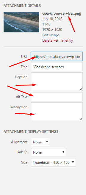
When it comes to image SEO google relies on image file names, ‘alt’ text, captions, file type, etc. I can go much more into detail but I recommend you check out this image SEO guide for a more detailed guide.
Note: Divi has an option to add alternate text in its Image Module settings which overrides the WordPress sections.
4. Use the right File Formats
Most images are either JPEG or PNG (sometimes even GIF) and these are good for most situations because of their widespread compatibility. It’s best practice to do the following:
- JPEG (JPG) – Great for photos
- PNG – These are better for smaller images that have more details
5. Don’t Go Overboard with Many images
Many people think it’s good to use many images in their website and blog posts however this can increase bloat and make the page load slow.
Most times it’s actually counter-intuitive to use more images as it just confuses and the meaning is low. Less is more and sometimes it’s better to use only a few but important images so as to keep things clean and effective.
For instance, if you write a sandal review, you want to balance out the content with product images and not just use multiple images of sandals. Bottom line? Balance out the right amount of content with images so as to keep a good balance for the reader. I suggest using a content tool like Grammarly to keep your content quality in check.
Final Thoughts: Optimizing Images for Divi
Images are a big part in any website however for it to work effectively it not only needs to look good but it also needs to be of the right size if not it will cause the website to load extremely slow and your visitors/customer will go to your competitor’s websites that have better-optimized images.
There is also no perfect size so don’t dwell on optimizing images too much just make sure it looks right on Divi’s responsive viewer and you should be in the green.
Lastly, if you have any queries do let me know in the comments below and I’ll get back to you as soon as I can furthermore you can reach out directly on my


 2.0 on Divi Gallery")